The Colour Edit: 7 Palettes We're Loving Right Now
We spend a lot of time looking at colour, how different shades sit together, what happens when you add a warmer tone to something cooler, and the combinations that can completely change the feel of a room.
And lately with the change of the seasons, we're finding ourselves drawn to colour again.
Not necessarily bright colour or anything overly trend-led, but richer, muddier shades mixed with warm neutrals and natural materials.
So, we've pulled together seven palettes we're really enjoying at the moment.
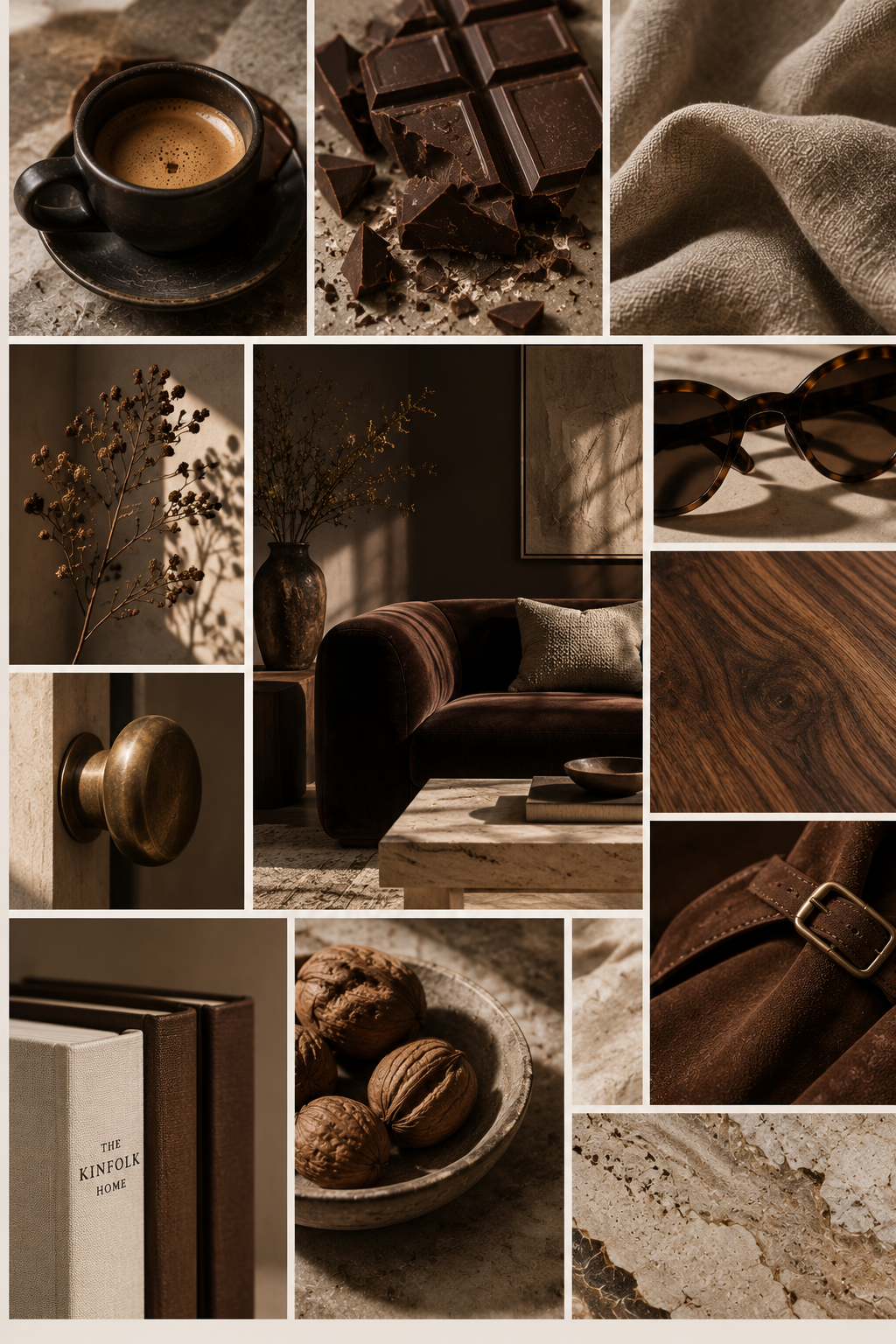
Bitter Chocolate
Deep, warm and really easy to live with.
Bitter chocolate works beautifully as an alternative to black when you want contrast without anything feeling too harsh. We love it with creamy whites and muted tonal greens, oatmeal linen, aged woods and touches of stone.
It can feel very sophisticated, but still relaxed and cosy, especially when there are plenty of natural textures involved.
Pair with: warm white, oak, linen, travertine and antique brass.
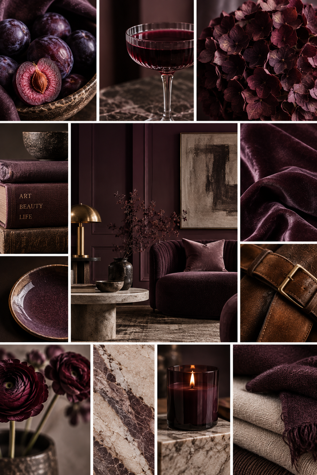
Damson & Tobacco
Probably one of the richer and most daring combinations in the edit, and one of our favourites.
The fig, mulberry shade brings depth without feeling overly purple, while tobacco introduces that warm, slightly worn-in quality that stops the scheme feeling too formal.
We'd keep the rest of the room relatively quiet and let these two shades do the work.
Pair with: walnut, warm neutrals, aged leather and soft off-white.
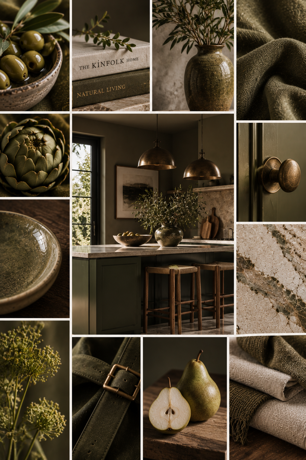
Grounded Olive
Green isn't going anywhere – but we're much more interested in these muddier, grounded versions than anything too fresh or bright.
We are in the olive green is a neutral club! It sits beautifully with timber, stone and linen and is particularly lovely in rooms where you want things to feel calm and settled.
Pair with: natural oak, chalky whites, oatmeal, dark timber and woven textures.
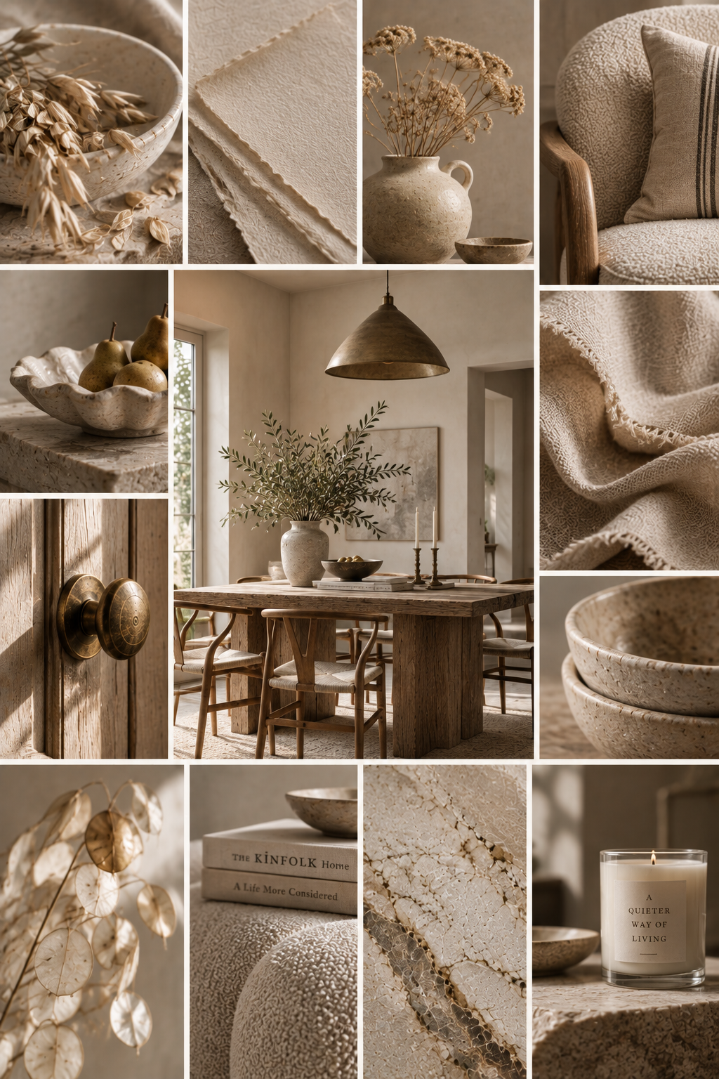
Oat & Parchment
For anyone who loves a neutral interior, this is how we'd keep it interesting.
The key is layering slightly different warm tones rather than choosing one shade and repeating it everywhere.
Oatmeal linen, parchment, warm plaster, pale woods and textured ceramics give the scheme depth while keeping everything wonderfully calm.
Pair with: basically every natural texture you can find.
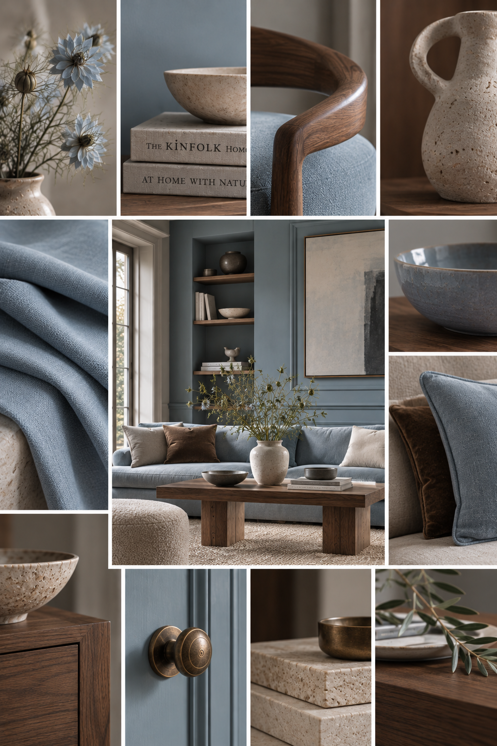
Powder Blue & Walnut
There's something about a soft, slightly greyed blue against darker wood that just works.
The soft blue brings freshness; the darker timber stops it feeling sweet.
We particularly love this combination in bedrooms, bathrooms and quieter living spaces, where it feels elegant without being overly formal.
Pair with: walnut, warm white, linen, brushed nickel and natural stone.
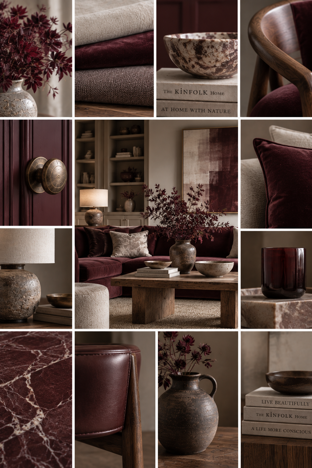
Oxblood & Stone
A little bolder, but absolutely beautiful when it's used sparingly.
Oxblood has a richness that can instantly make a neutral room feel more interesting. Against stone and warm off-whites, it feels sophisticated rather than dramatic.
We'd use it as an accent rather than filling an entire room with it – an occasional chair, a cushion, artwork or perhaps a beautifully painted piece of furniture.
Pair with: grained marble, limestone, dark timber, warm white and aged metals.
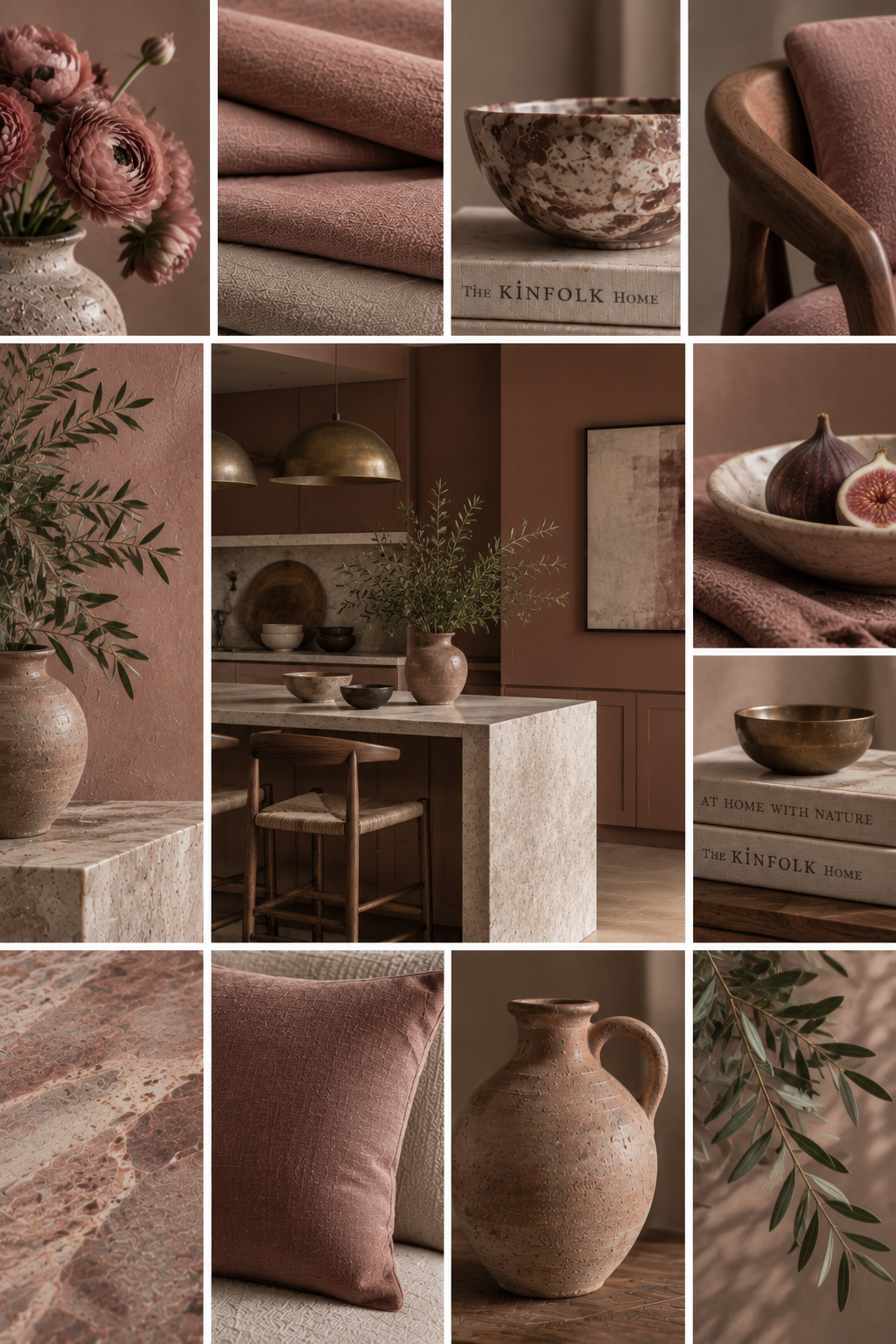
Rose Earth
Not pink. Or at least, not pink pink.
Rose Earth sits somewhere between dusty rose, plaster and warm terracotta and brings just enough softness to a scheme without making it feel overly feminine.
It's particularly lovely alongside earthy browns and natural materials.
Pair with: chocolate brown, oak, linen, stone and warm cream.
Finding Your Palette
The colours we're most drawn to tend to have something in common: they aren't perfect.
They're slightly muddy, softened or earthy. Tones that sit comfortably alongside natural materials and don't feel as though they'll date the moment the next trend arrives.
And perhaps that's why these seven combinations work so well together.
They're interesting without shouting and warm without feeling overly traditional.
And, most importantly, they feel like colours you could actually live with.
We'll be sharing more of colour edits over the coming weeks, looking at individual palettes in more detail and exploring different ways to bring them into your home.